Vintage tech is fascinating. Often, its underlying machinery is visible to the naked eye, allowing us to understand opaque abstractions instinctively. Within every man-made object is inspiration, and a narrative diligently instructive of why things can become so complex. Technology is seemingly less arbitrary, less magic-like, when we trace its history and circumstances.
Naturally, technology and design are coupled in some inextricable, amorphous, yet curious ways. Each informs the other, but design is what most visibly reflects the limitations of our tools, materials, processes, tastes, and objectives. Bound by technological constraints, iconic avenues of aesthetic emerge, as though by fate, in dignified defiance to domain standards of beauty.
In type design, this phenomenon is clearly attested by Magnetic Ink Character Recognition (“MICR”) typefaces which were developed for the banking industry in the 1950s to facilitate automated processing of cheques. The material limitations of the time gave birth to typographic anomalies, the aesthetics of which are now deeply emblematic of computing throughout the 60s and 70s, legends of fraud, retrofuturism, and dystopian world imaginings.
The MICR Duo
The prevailing MICR typefaces are E13B and CMC7. We see these two frequently, some of us on a daily basis, on cheques and banknotes, but they almost never register on our minds as anything special. Some things just hide in plain sight.

E13B, the subject of my experiment, was invented in the 1950s by SRI International (these are the same folks that brought you Siri!) as part of a project called ERMA. It is rather routinely named, an instance of revision history as brand; “E” is the fifth typeface proposed for the project if you start counting at “A,” 13 is from 0.013 inches, the elemental grid unit size, and “B” is the second revision of this design. CMC7, which is mainly used in Europe and Latin America, was designed in 1957 by French computer company then named Machines Bull. For a variety of reasons, it didn't have the same cultural impact of E13B.
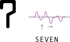
Traditionally, MICR fonts are printed in a special ink and thereafter magnetized with an electrical current. Each printed symbol generates a distinct waveform when passed under a magnetic-reading head. The system then analyzes the resulting signals and matches them against digits and routing instructions. The way the ink is distributed inside each symbol determines the waveform, so the design had to surrender to some reality of magnetism: similarly contrasted shapes could generate similar waveforms— something to be strictly avoided. For E13B, the talented designer(s) conceptualized an honest framework of geometric monolines and the occasional slab to achieve this dual-goal of efficient machine and human readability.
A Fount for the Space Age
With how prevasive and ancient MICR fonts are, I was slightly surprised when I couldn't find an Eastern Arabic version, especially since there were numerous attempts at creating alphabet complements in the style of E13B. Earliest of these is Moore Computer (1968) by Visual Graphics Corporation. Its design follows closely the configuration of the original E13B symbols. Notable as well is Bob Newman's Data Seventy (1970) which, while manifests the general mode of E13B, takes the liberty of imagining new digit shapes. Westminster (1971) by Leo Maggs is possibly the most prevalent spinoff, having been bundled as a digital font with Windows 98. There are many other efforts, and the chronology might be slightly off here, but the 3 mentioned are seminal and representative of the genre.
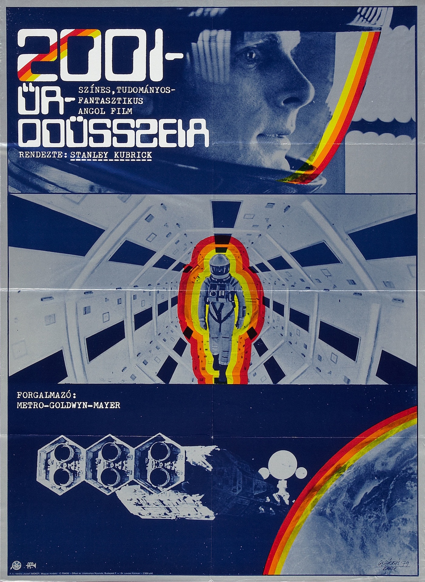
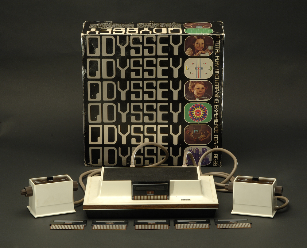
“Style Transfer”
So I set out to design Eastern Arabic numerals in the aesthetic of E13B. One, because Arabic is my mother tongue. Two, because the font is used by financial institutions in Arabia. And three, why not? I think it's about time, and it's incredibly tempting to attempt this sort of thing.
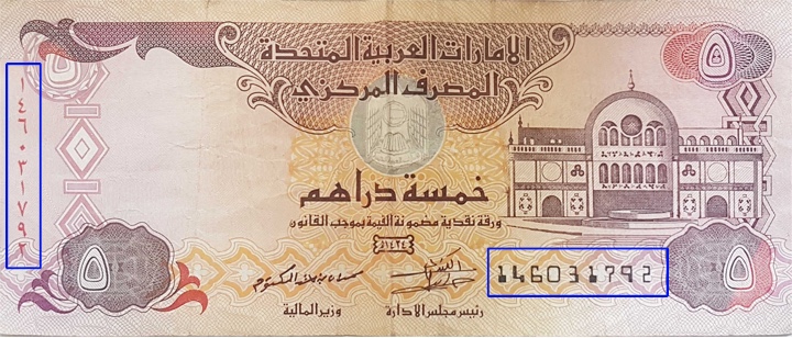
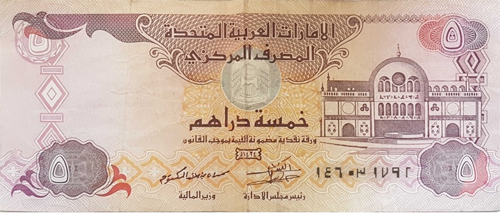
Are the red digits functional? A counterfeit prevention measure perhaps? Or do they merely compensate for a cultural pain?
To design the new digits, I decided to first reproduce the original 14 E13B glyphs—a reconnaissance of sorts—to familiarize myself with the typeface's spirit and evocations.
The good news is that E13B and CMC7 character designs are standardized in ISO 1004-1:2013. The specification largely targets printer and reader manufacturers with things like precise print tolerances, ink and paper considerations, and a bunch of other things. Bad news is that it costs $160 to access. Fortunately, with the power of the internet, you can find relevant bits & pieces of it in printer manuals and patent filings. It's also easy to reverse engineer the design language from printed cheques and manufacturer specimens.
Anatomy of E13B
ISO 1004-1:2013 outlines dimensions of the final printed output, so we need to translate those fractions of inches into convenient virtual units that we can use in our type design app. Here's that in type jargon:
- Each glyph has a fixed width of 0.125 inches, for a total of 8 printed characters per inch.
- We can therefore set the font's UPM to 1250, and make each glyph a 1250-unit box. This has 2 effects:
- Each design unit corresponds to 0.0001 of an inch.
- At 72 PPI, we can set the font size to 9pt to print 8 characters per inch.
- The ink is confined to a 7x9 grid of 130-unit squares. This leaves a +340 units for side bearings.
- Constant right side bearings equal to 170 units (i.e. the shape is right-aligned inside the 7x9 grid).
- Stroke size in multiples of 130-unit squares (130x65-unit rectangles are also allowed).
- Corder radii equal to 65 units (except for the inner corner radii of the 0 glyph, which are 130 units wide, and its outer radii, which are 260 units wide).
- My interpretation adds 40 units to the ascender and -40 to the descender to arrive at a perfect 1250-unit wide square.
Design Decisions
With the original E13B glyphs out of the way, we're ready for the creative part!
For now, we won't explore anything related to magnetism or the waveforms produced by the newly designed symbols. Ours is mostly an exercise in pastiche. I'm sure that with functional criteria these designs will change drastically. However, if you know of a way to digitally simulate the waveforms produced by these glyphs, please get in touch.
Here were some general guidelines I tried to stick to:
- Try to conform to the ISO 1004-1:2013.
- Be somewhat visually comfortable to Arabic readers.
- Shapes must be unique and distinct from the existing E13B numerals.
- Abstract away diagonals.
- Stay true to Naskh e.g. emphasize horizontal stress where appropriate (is this really necessary?)
- Ignore specific width requirements. e.g. European/Arabic zero is 910 units wide, which is unreasonable for Eastern Arabic zero.
- Unlike Arabic letters, digits run left-to-right, so we don't need to reverse side bearings or left-align the shapes in the design space.
